From flat to form.
Every physical brand piece begins as something flat — a file, a sheet, a pattern. The interesting work happens when it becomes an object.
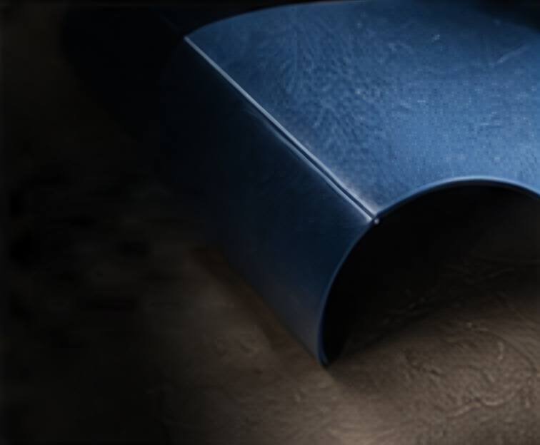
Most brand work lives on a screen. Logos, colour palettes and layouts are designed flat, approved flat and shared flat. But the moment a brand needs to exist in the world, it has to become something with weight, edges, folds and texture.
That transition — from flat to form — is where many brands lose something, and where the best physical work is made.
What changes when something becomes an object
On screen, colour is light. On paper or fabric, it is pigment sitting on a surface that absorbs, reflects and ages. A colour that looks perfect in a file can turn muddy on kraft or harsh on a coated board.
On screen, a box is a flat dieline. In the hand, it has a front and a back, an inside and an outside, an order in which it is opened. Graphics that work on a flat sheet can break across a fold or disappear on a side panel nobody looks at.
Prototyping is design
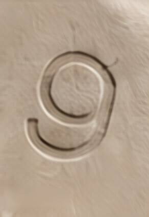
We don’t treat prototyping as a final check. It’s where most of the design decisions are made. A rough sample made by hand in the first week teaches more than a polished render. It shows how a fold feels, whether a handle is comfortable, how the light falls on a deboss.
Material is part of the idea
The best physical ideas are inseparable from their material. A curve that only works because the board is thick enough to hold it. A colour that only works because the fabric is undyed. When material is chosen at the end, ideas get flattened. When it’s chosen at the start, they gain form.
From flat to form is the whole of what we do: taking a brand that exists as an idea and giving it a body people can hold.