8 paper finishes that completely change how packaging feels.
Two boxes can share the same artwork and feel like they come from different brands. Most of that difference is in the finish.
Print the same artwork on two different papers and you get two different brands. The finish — how a surface has been treated, coated or worked — changes how colour sits, how light falls and, above all, how something feels in the hand. Here are eight finishes we reach for, and what each one says.
1. Uncoated
Uncoated stock lets ink sink into the fibre. Colours soften, blacks go slightly warm and the surface stays dry to the touch. It reads as honest and natural, and it is forgiving of handling.
2. Matte coated
A matte coating keeps colours crisp without shine. It is a good default when the artwork carries detail or photography and the brand wants to feel calm rather than glossy.
3. Soft-touch lamination
A thin film with a velvety, almost suede-like feel. It makes a box feel precious immediately — which is exactly why it should be used sparingly. On everything, it stops meaning anything.
4. Debossing
Pressing a mark into the board so it sits below the surface. Debossing is quiet: it catches light at an angle and invites a thumb to find it. It works especially well on uncoated stocks, where the fibre compresses visibly.
5. Embossing
The opposite — a mark raised above the surface. Embossing is more assertive and more architectural, and it changes the back of the sheet too, so it needs to be planned with the structure.
6. Foil
Metallic or pigment foil applied with heat and pressure. Used as a single small detail it signals care; used across a whole surface it can tip into decoration. We prefer matte or tonal foils that feel considered rather than loud.
7. Spot varnish
A gloss or matte varnish applied to one area, so a mark changes finish rather than colour. It is a subtle way to add depth without adding another ink.
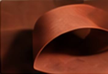
8. Coloured-through board
Not a finish applied to the surface but a board dyed through its core, so cut edges and folds stay the same colour. It is one of the simplest ways to make a box feel solid and complete.
Choosing well
The right finish depends on what the object is for, how often it will be handled and what the brand needs to say. Our rule is simple: one finish that means something is worth more than four that don’t.